The complete visual and verbal identity system for InteliVoice — the AI voice receptionist that never misses a call.
Before a single color is chosen or a font is set, great brands start with a clear answer to one question: why do we exist? Everything that follows — the mark, the palette, the words — is an expression of that answer.
InteliVoice gives businesses an AI receptionist that is always on, always professional, and always ready — so no customer ever reaches a voicemail again. We turn every incoming call into an experience.
We are building the infrastructure that replaces outdated phone trees and undertrained staff with a single intelligent voice that represents every brand with precision, warmth, and speed.
InteliVoice is not a chatbot with a voice. It is a fully trained AI host — customized to your business, your tone, and your customers. It handles reservations, inquiries, bookings, and escalations without a script.
Every business deserves a world-class first impression. InteliVoice delivers that 24 hours a day, 7 days a week — at a fraction of the cost of human staffing, with zero sick days, zero attitude, and zero missed calls.
Brand Personality: Confident but not cold. Premium but not pretentious. Intelligent but immediately understood. InteliVoice sounds like the best receptionist you ever hired — not like a robot.
The InteliVoice logo is built around a single icon — the Signal i Mark — and a two-tone wordmark. Every element of the system is deliberate. Nothing is decorative.
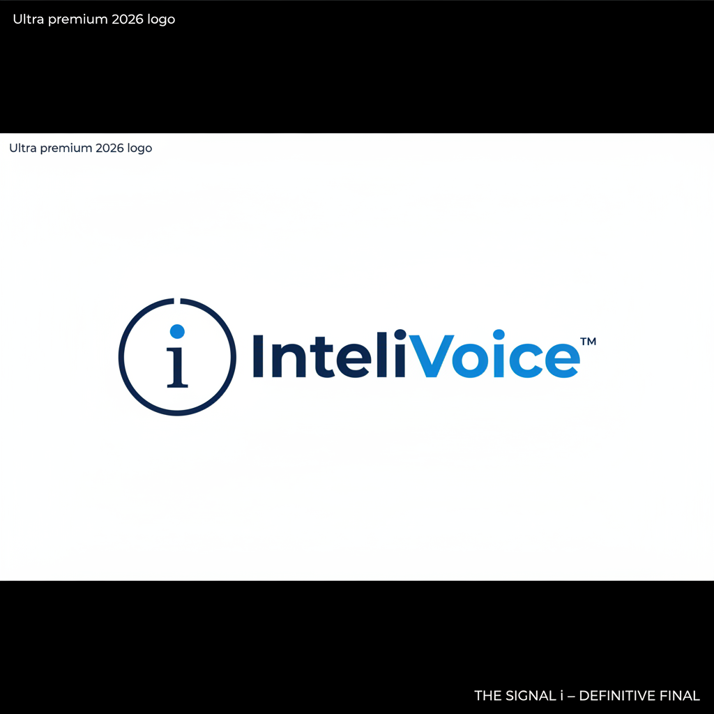
A thin open circle with a deliberate gap at the top. Represents an incoming call frozen in time — and the brand promise of always receiving.
The dot of the lowercase "i" — rendered in electric blue (#2563ff). This is the identity anchor. The AI signal. The moment a call connects. Three readings: letter dot, signal pulse, active indicator light.
A clean geometric vertical stroke in deep navy. Together with the blue dot it forms the lowercase "i" — standing for InteliVoice and intelligence.
The intentional break at the top of the ring. The micro-detail identity anchor that makes this mark unmistakably ours. It signals openness, reception, and the breath before a greeting.
Primary — Light Background
Dark Mode — Dark Background
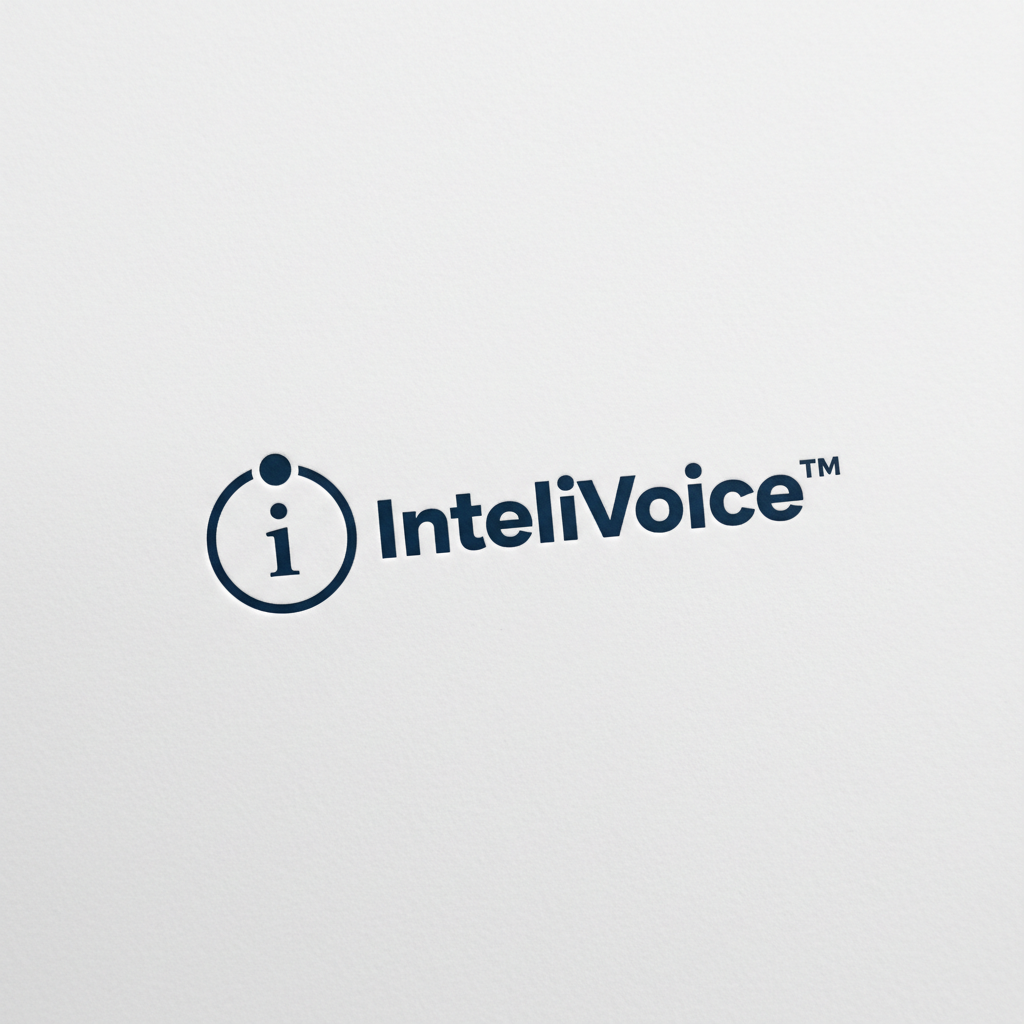
Monochrome — Print / Emboss
Always maintain a minimum clear space equal to the height of the "i" mark on all four sides of the logo. Never crowd the mark against other elements, edges, or text.
The dashed blue area represents minimum required clear space.
InteliVoice uses a two-color primary system — deep navy for authority and trust, electric blue for intelligence and activation — supported by a neutral system for UI and background work.
Deep Navy — Authority, trust, precision. The color of premium institutions. Anchors the brand in credibility.
Electric Blue — Intelligence, activation, signal. The color of AI. Used only where it matters most — never overused.
Neutrals — Breathing room. White and light gray let the two primary colors do their work without competing.
Rule: Electric blue is used sparingly — the signal dot, the "Voice" wordmark, and active UI elements only. Deep navy carries the weight. Blue is the moment of activation. Together they tell the story of intelligence answering the call.
InteliVoice uses a single typeface across all applications: Inter. One font, mastered. Weight contrast and tracking do all the expressive work — no decorative faces, no exceptions.
InteliVoice is not a feature — it is a presence. The way it speaks should match the way it sounds: intelligent, warm, direct, and utterly professional. No jargon. No filler. No corporate speak.
InteliVoice speaks with authority. It does not hedge, apologize unnecessarily, or use filler language. It knows what it is, what it does, and what it can promise.
We do not use AI jargon, industry buzzwords, or technical language with customers. Every sentence should be understandable to a business owner who has never used AI.
Technology should feel human. InteliVoice is not cold or robotic. It is the voice of a highly competent person — one who genuinely cares about getting it right.
Short sentences. Active voice. No padding. InteliVoice respects the reader's time the same way it respects the caller's time — by getting to the point immediately.
Never use: em dashes, ellipses as dramatic pauses, "leverage," "synergy," "seamlessly," "cutting-edge," "revolutionize," "game-changing," or any phrase that reads like it was written by a committee.
White space is not empty — it is the visual equivalent of a pause before speaking. InteliVoice layouts breathe. Everything is given room to land.
Motion in the InteliVoice system should feel like the brand sounds — precise, natural, and never rushed. Animation exists to guide, confirm, and reassure. Not to entertain.
Every animation must have a reason. Transitions communicate state changes. Hover states confirm interactivity. Loading states show progress. Motion is never decorative.
Use ease-in-out for all transitions. Elements should accelerate into motion and decelerate out. Hard linear transitions feel mechanical — avoid them everywhere.
The signal dot can pulse gently to indicate the AI is live and listening. This is the signature motion of the InteliVoice brand — a slow, confident heartbeat at 0.85 scale.
The logo ring can animate in by sweeping clockwise from the gap — like a signal completing its rotation. Use this for intro animations on presentations and web heroes only.
Content sections enter by fading up 8px. This subtle lift mirrors the brand's sense of attentiveness — content rising to meet the viewer as they scroll.
InteliVoice does not bounce. It does not spring. Elastic or playful easing curves are not part of this system. The brand is premium — the motion should feel the same.
How the InteliVoice identity lives in the real world — from business cards to dashboards, email signatures to presentations.
White background, navy logo, navy text. 3.5 x 2 inches. Matte finish preferred.
Navy background, white ring mark, electric blue dot. Foil stamp the dot for premium print.
At 16x16, the stem of the "i" may be dropped. Only the ring and blue dot need to be visible — together they are enough to identify the mark.
Brand standards only protect the brand if they are enforced. These rules apply to all teams, contractors, partners, and agencies working with the InteliVoice identity.
The ™ symbol must appear after "InteliVoice" in all marketing materials, website headers, email signatures, and product interfaces until the mark is formally registered with the USPTO. Once registered, replace ™ with ®.
Any partner, reseller, or integration that uses the InteliVoice name or mark must receive written approval from NGX Agency. The logo may not be altered, co-branded without approval, or used in a way that implies endorsement.
Always use SVG for digital applications. Use EPS or AI for print. Never use low-resolution PNG files for production work. The logo is a precision mark — low-quality reproduction undermines the brand.
This document is versioned using the NGX versioning standard: v1_043026. Any updates to brand standards must increment the version number and note what changed. Silently overwriting the brand guide is not permitted.